

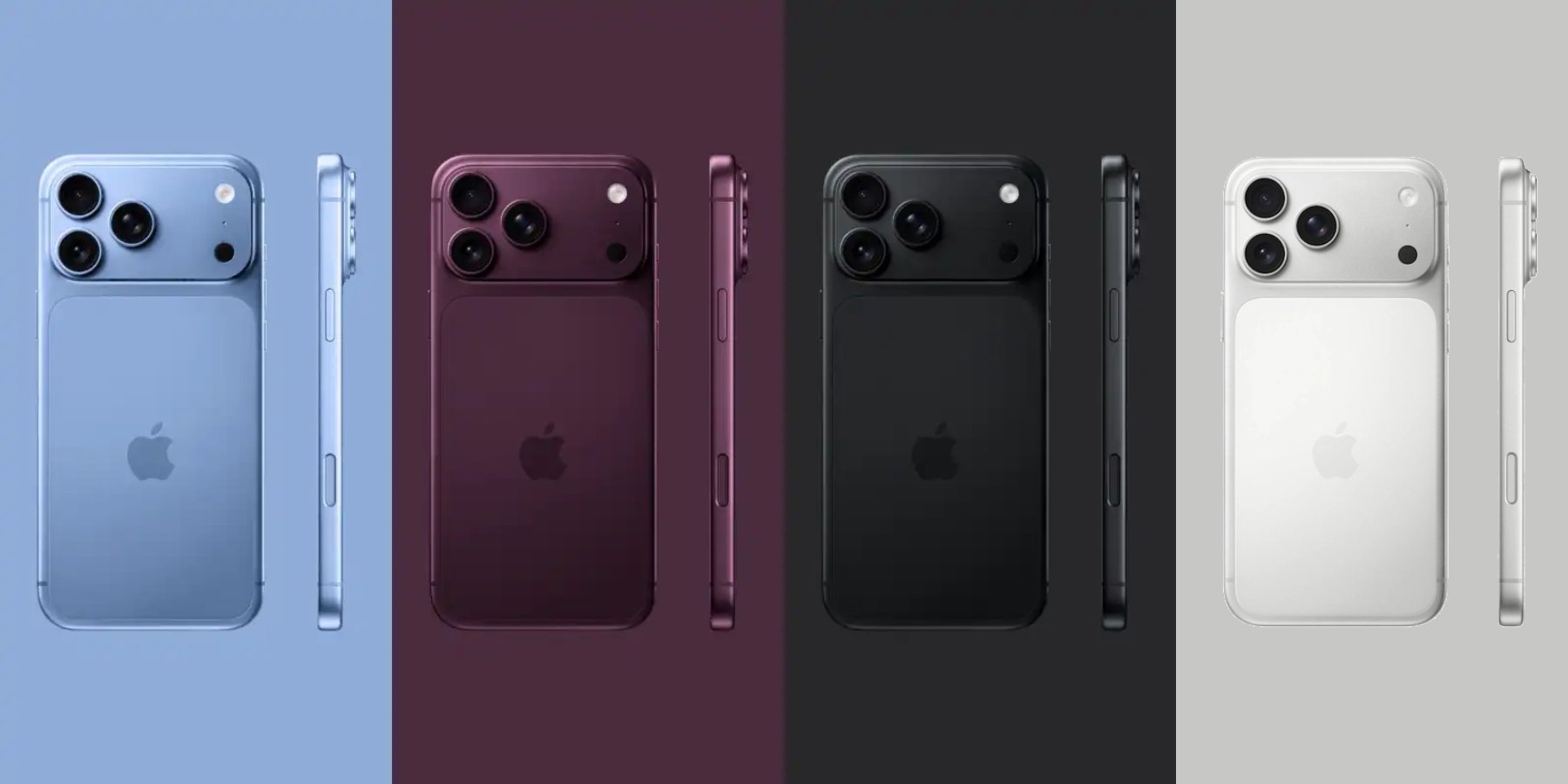
The upcoming iPhone 18 Pro introduces a new Dark Cherry color, marking a shift in Apple’s design language and reflecting broader technological trends in user experience and product differentiation.
As Apple prepares to unveil its latest iPhone models, the iPhone 18 Pro and iPhone 18 Pro Max, a notable change emerges in its design ethos: color selection. This year, the spotlight turns to a color named Dark Cherry, a deeper and more nuanced hue that navigates between red and purple. Such subtle shifts in design, although seemingly cosmetic, signal a deeper pattern in how technology brands orchestrate product differentiation and user attraction.
Navigating Color within Tech Ecosystems
The introduction of the Dark Cherry color represents more than a simple palette refresh; it is an exercise in user experience optimization. Apple’s choice indicates an understanding of color psychology, suggesting a moodier aesthetic that appeals to a mature audience possibly seeking sophistication and uniqueness. This choice is a nod to the emotional engagement that technology seeks to evoke, a strategic move to align user expectation with product identity.
Additionally, the new palette, including Silver, Dark Gray, and Light Blue, illustrates a calculated approach in balancing tradition and innovation. The subtle color evolution is key to maintaining brand consistency while adapting to market shifts, creating a visible signal of change that resonates with dynamic consumer preferences.
Systemic Implications of Color Evolution
From a technological perspective, the choice of color extends beyond aesthetics into realms of material science and manufacturing processes. Implementation of a new color requires adaptation within production lines, necessitating precision in material matching, which can lead to innovations in coatings and finishes.
Moreover, color choice reflects broader technological trends where user devices become increasingly personal. This development fosters a deeper integration of digital behavior into daily life, as consumers choose devices not only for functionality but as expressions of identity. Such trends are pivotal in the ongoing transformation of consumer electronics into lifestyle artifacts.
Dark Cherry: The Design Frontier
The complexity of the Dark Cherry shade epitomizes the dual challenge of maintaining vibrancy and consistency across varied lighting conditions. This push towards a uniform look represents an underlying goal of achieving seamless user experience continuity, bridging the gap between digital interfaces and physical presentation.
Apple’s strategy to minimize the discrepancy between the glass back and aluminum frame further embodies the pursuit of a cohesive design language. This harmonization can be seen as a metaphor for unifying digital ecosystems, where aesthetic and functional integration facilitates smoother human-device interaction.
Conservative Approach to iPhone Ultra
In contrast to the iPhone 18 Pro, the foldable iPhone Ultra’s conservative color palette underlines a distinct market positioning strategy. With the Ultra expected to command a premium price point above $2,000, Apple’s cautious approach to color selection, gravitating towards indigo and white, reflects an emphasis on universality and longevity.
This restraint supports a focus on other technological innovations within the device, suggesting that color, while important, is secondary to pioneering functionalities aimed at reshaping user interaction paradigms through advanced screen technologies and foldable forms.
Assessment of Design Move
Pattern detected: design differentiation and user experience alignment.
Apple’s color strategy for the iPhone 18 Pro and Ultra is emblematic of a broader systemic shift within design-centric technology products. As devices increasingly reflect personal and cultural values, color becomes a key vector for brand storytelling and consumer engagement.
This maneuver underscores a critical aspect of digital behavior adaptation, where colors mediate user perception and device desirability. As we continue to monitor such developments, the implications for AI-driven design personalization and predictive analytics in color preference stand as areas ripe for future exploration. Observation recorded.